Vivid Real
Created at:
2024-07-23 14:47:20
Size:
512 x 512
Prompt:
Create an icon for the Sirdar Group that represents their brand identity and values. The icon should be a modern and professional compass, symbolising guidance, direction, and leadership. Here are the specific requirements: Style: The icon should have a sleek, contemporary design. Use a combination of flat and line art styles to convey simplicity and elegance. Colours: Use the primary brand colours of Sirdar Group, primarily red (#ED1C24) and white, with possible accents of grey and black as seen on their website. Ensure the colours are harmonious and align with the overall brand aesthetic. Design Elements: The compass should be central to the design, with clean lines and precise detailing. Incorporate subtle elements that suggest movement and direction, such as arrows or cardinal points. Avoid overly intricate designs; keep the icon clear and recognisable at various sizes. Reflect the mountainous and adventurous theme observed on the website. Technical Specifications: The icon should be scalable and look good in sizes ranging from 16x16 pixels to 512x512 pixels. Provide the icon in SVG and PNG formats. Ensure the icon maintains clarity and quality when scaled. Alignment with Brand Values: Reflect the Sirdar Group’s focus on leadership, innovation, and strategic guidance. The design should exude trustworthiness and reliability. Audience: The icon should appeal to business professionals and decision-makers in various industries. Consider the international presence of Sirdar Group, ensuring the design is universally understandable. Website Context: Attached is a screenshot from the website. The icon should align with the adventurous, leadership-driven theme of the website, as depicted by the mountain imagery and strong, dynamic design elements. Integrate seamlessly with the existing website design, maintaining visual coherence with the current branding and layout.
Similar Icons
Stick Logo
512 x 512
Prompt: Multi-storey building. House name Saratovskaya, house 31. Please develop a unique and visually appealing design that can be used as a logo or icon for the channel
Surreal Style
512 x 512
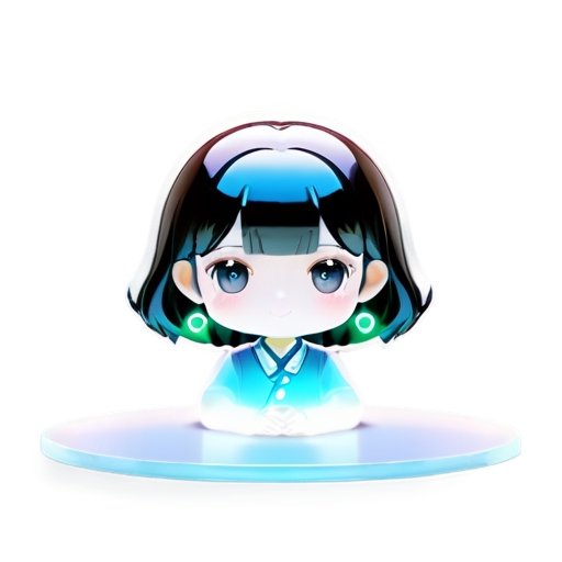
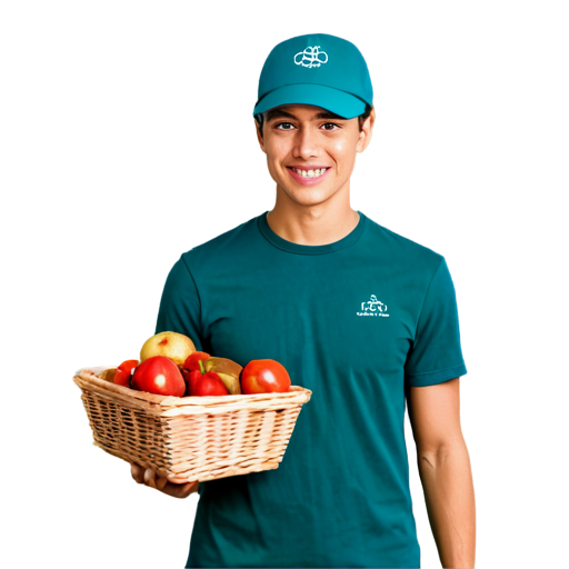
Avatar for the lunch ordering group within the organization "Studio of agricultural systems"
Vivid Real
512 x 512
Avatar for the lunch ordering group within the organization "Studio of agricultural systems"
Stick Logo
512 x 512
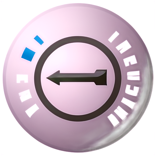
Consistent arrows around a circle a key in the middle, depicting the phrase consistency is the key